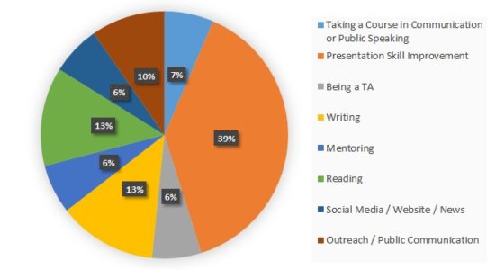
Story written by Quercus Hamlin and Changcheng Pu
Scientists are always looking for ways to better express information to both the public and peers. In a world of “big data,” complex theories, and short attention spans, visualization is a key tool to understanding data and to expressing findings. However, not all figures are created equal. EMPOWER students sought to improve their understanding of data visualization through a student-led discussion and visit from Dr. Christa Kelleher. Dr. Kelleher presents ten guidelines to create effective, comprehensive data visualization in “Ten guidelines for effective visualization in scientific publications” (2010). These guidelines synthesize design elements that improve comprehension and tips to avoid misleading figures.
Before Dr. Kelleher’s visit, EMPOWER students participated in a student-led discussion analyzing different figures from peer reviewed papers. Students pointed out positive and negative design decisions in figures and discussed strategies for improvement. Analyzing and critiquing other figures can help scientists develop better understanding of what to do and what to avoid in their own figures.
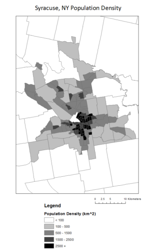
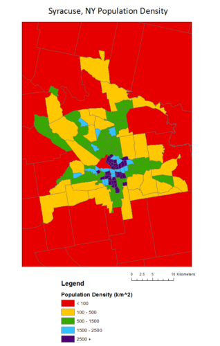
For example, different color schemes facilitate different types of data. In her discussion with EMPOWER students, Dr. Kelleher pointed out that a rainbow color scheme creates false difference in perceived values and can be hard to interpret. Consider the two maps of population density in Syracuse, NY census tracks: most would find the grey scale map easier to find a pattern in. The dark values are centered around the city center and densities become lower as they get farther away. In the rainbow map, the values (lightness or darkness) of the colors do not gradually get darker, so it is harder to quickly interpret the middle values, specifically blue and green. While the rainbow and legend gives us the “order” to figure this out, it is generally less intuitive. Figures using various hues (the “color” of a color – green, red, blue) better represent qualitative or categorical data, like land use. Differences in lightness and darkness better represent changes in intensity of numerical quantities.
Overall, data visualization is a key part of a modern science: our design choices influence how others understand our science. Scientists must aim to understand design and utilize it to further both public and peer understanding – after all, a picture is worth a thousand words!
(images – data from US Census Bureau, maps prepared by Quercus Hamlin)
 Climate change may result in broad effects to our most treasured scenic getaways, the National Parks. Initial reactions may be to consider how warmer temperatures will impact wildlife or other natural beauties such as glaciers. However, it is also important for park management to better understand how climate change will affect park attendance, so that resources can be focused in areas that will be impacted the most. Attendance is generally dependent on the mean monthly temperatures of a park; more people visit parks when temperatures are favorable. Parks such as Volcanoes National Park in Hawaii, which has a pleasant temperature year-round, has consistent attendance throughout the year; while parks located in colder climates tend to have higher attendance in the warm summer months and few visitors in the winter. An interesting case study by Albano et al. (2013) examined climate change’s impact on attendance in three National Parks in Alaska. This study predicted an increase in park attendance in the coming years, based on a growing “peak season,” which follows a longer period of favorable climate.